A fashion brand built from the ground up for retail scale.
CLEVÉ is a complete fashion brand created for Poland's largest retail chain — from strategy and naming to identity, a full packaging system and photography. A brand that had to work as one coherent system from day one.
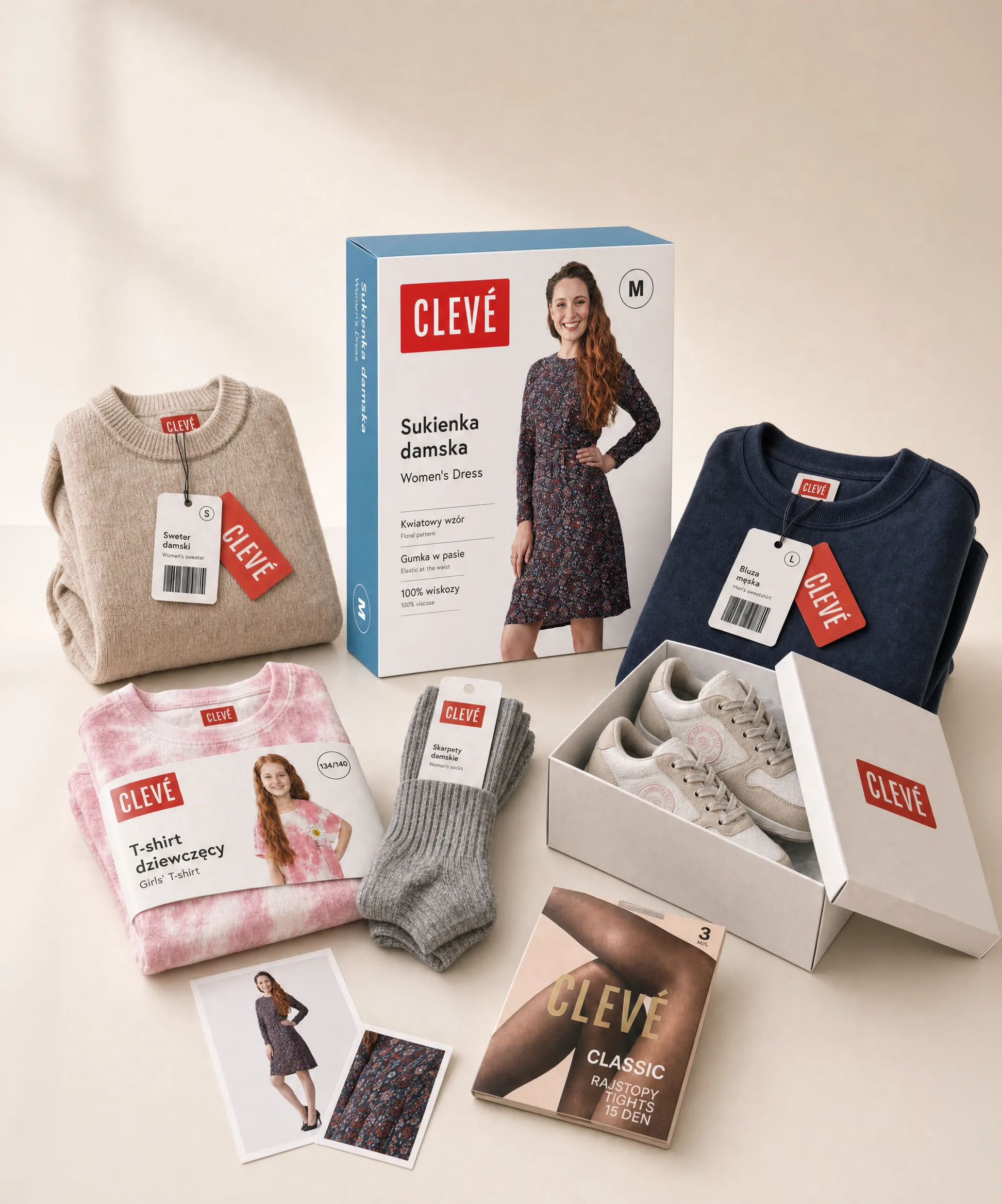
We knew the brand before we changed it.
Before CLEVÉ, we had worked for years with Tom & Rose — Biedronka's previous fashion brand — across communication, packaging, content production, digital and campaigns. We entered the project with real knowledge of the category and the customer.
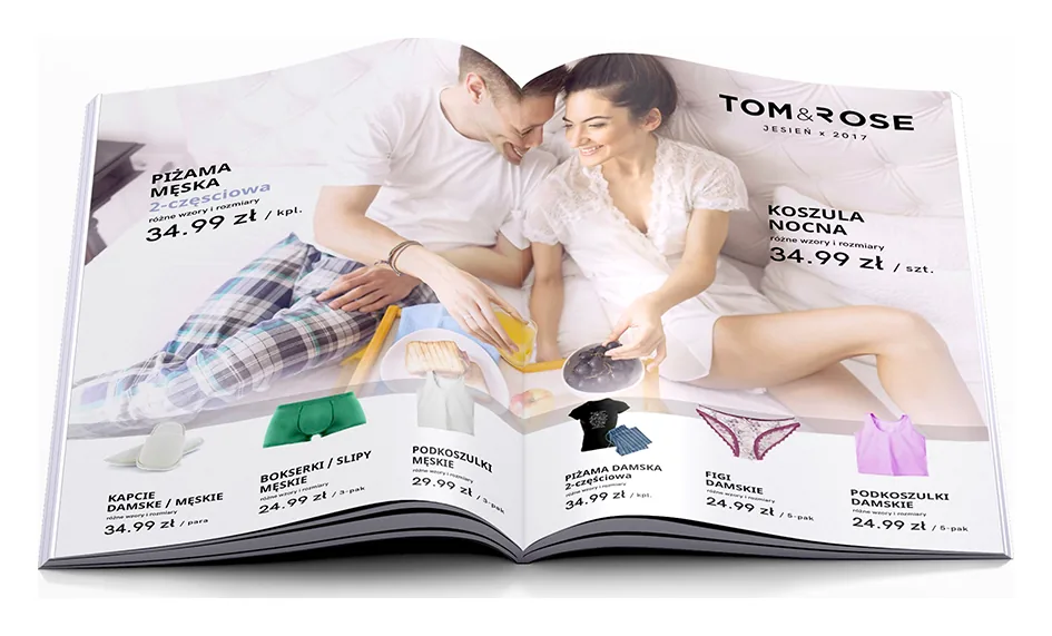
The brief started with a refresh. The challenge was bigger.
The brand needed to be clearer, more visible, more contemporary and more scalable — keeping existing customers while opening up to a younger audience.
- Strengthen brand recognition
- Improve packaging visibility
- Make product choice easier
- Support a broader assortment
- Stay consistent across formats
- Work at national-retail speed
From refresh to rebrand.
After strategic analysis, we recommended a full rebrand rather than a cosmetic update. The opportunity wasn’t to improve the old brand — it was to build a clearer, stronger and more scalable one.
- Starting point Tom & Rose An existing fashion brand due for a refresh.
- The turn Strategic analysis Category, consumer and retail reality reassessed.
- Outcome CLEVÉ A new fashion brand, built from the ground up.
What began as a refresh became a full brand-creation project.
A name built to work beyond the concept stage.
We developed a broad naming field and screened selected directions for EUIPO registration potential. The chosen name — CLEVÉ — gave the brand a short, distinctive and ownable identity: premium fashion cues, simple enough for mass retail, distinctive enough to build a brand around.
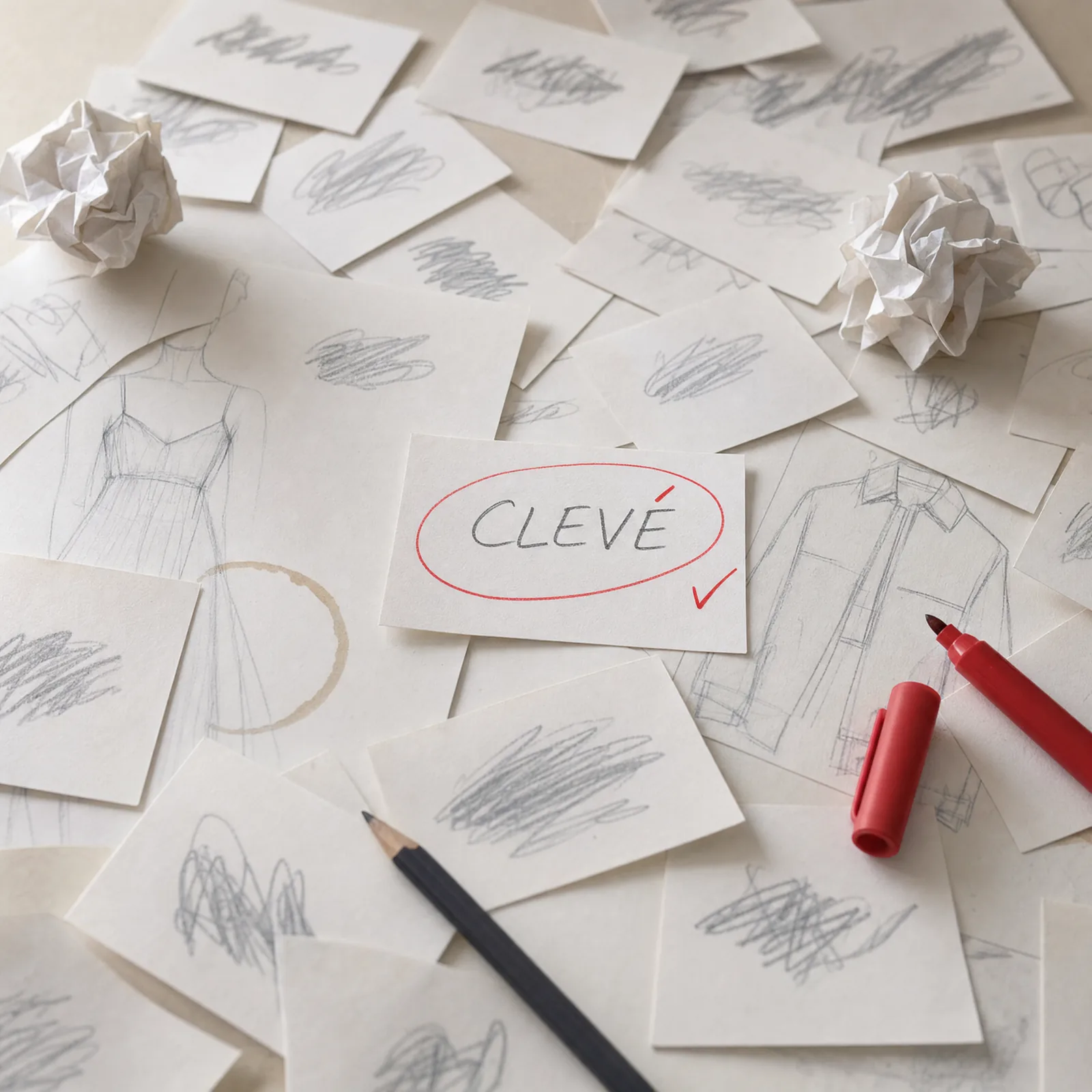
CLEVÉ was built around a simple promise: style and quality within reach — contemporary and attractive, never distant or exclusive.
Accessibility
Style that stays within reach — no compromise in the everyday choice.
Quality
Good quality as a standard, not an oversized promise.
Contemporary style
A current fashion language, legible to a broad audience.
Trust
Consistency and confidence that build an everyday relationship.
One identity. Many categories.
CLEVÉ needed a visual system flexible enough to work across women, men, kids, leather, accessories and special lines — without losing recognition. Clear, modular and scalable: from a single SKU to a full retail assortment.
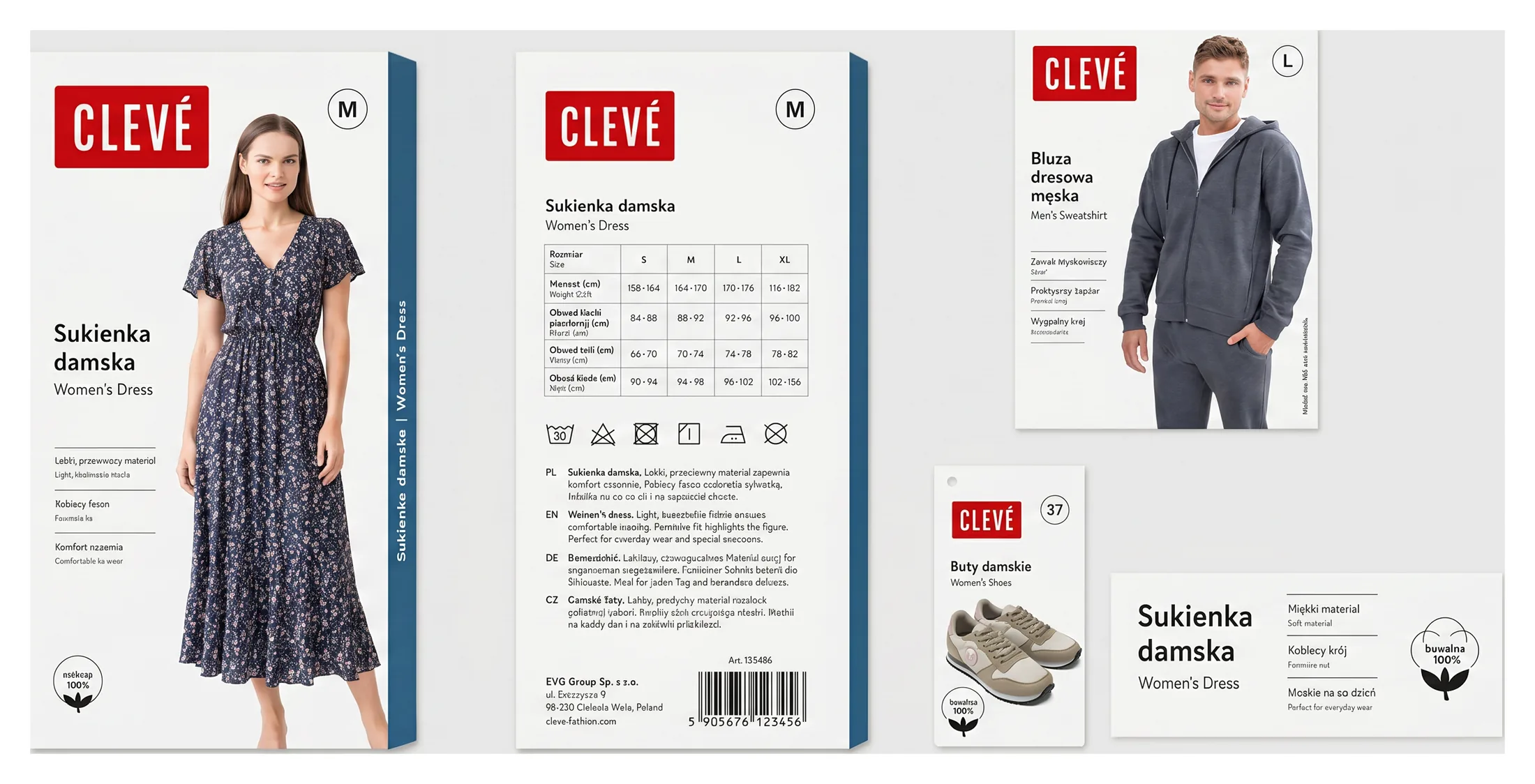
Packaging that had to sell, explain and scale.
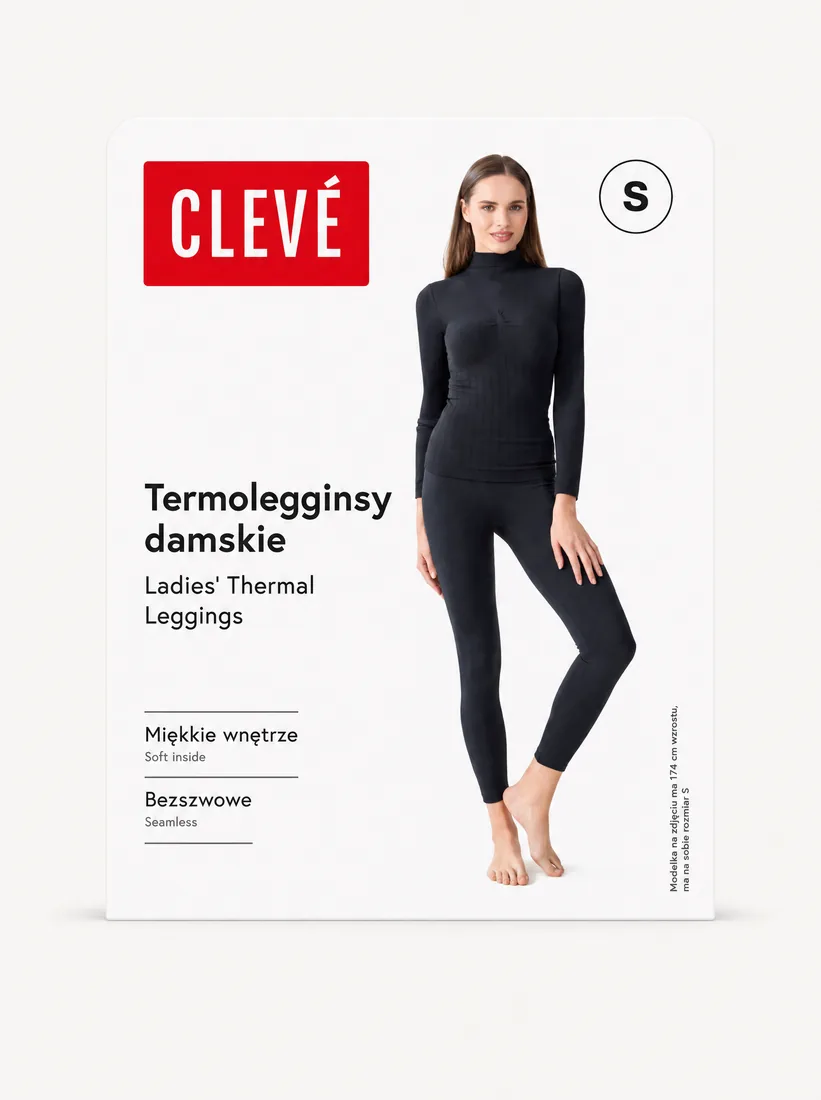
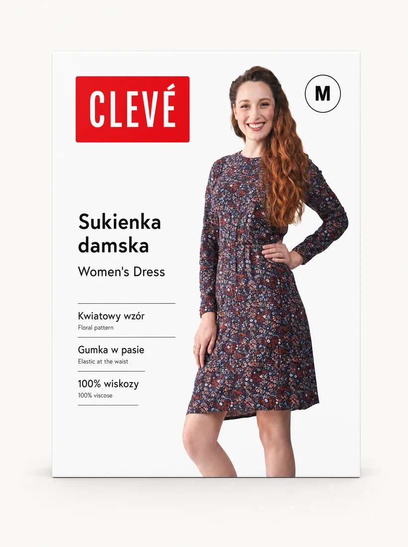
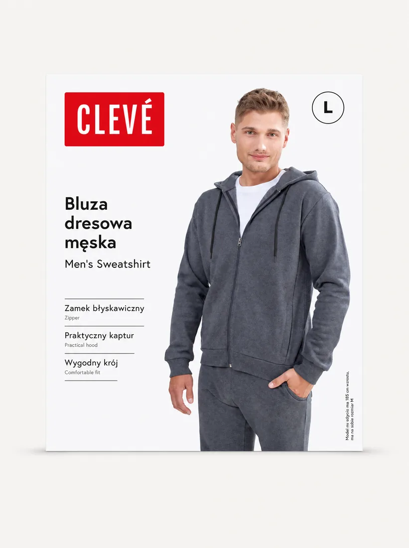
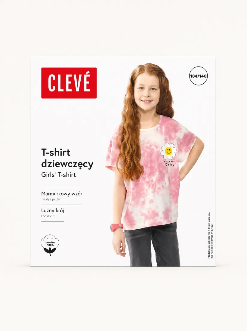
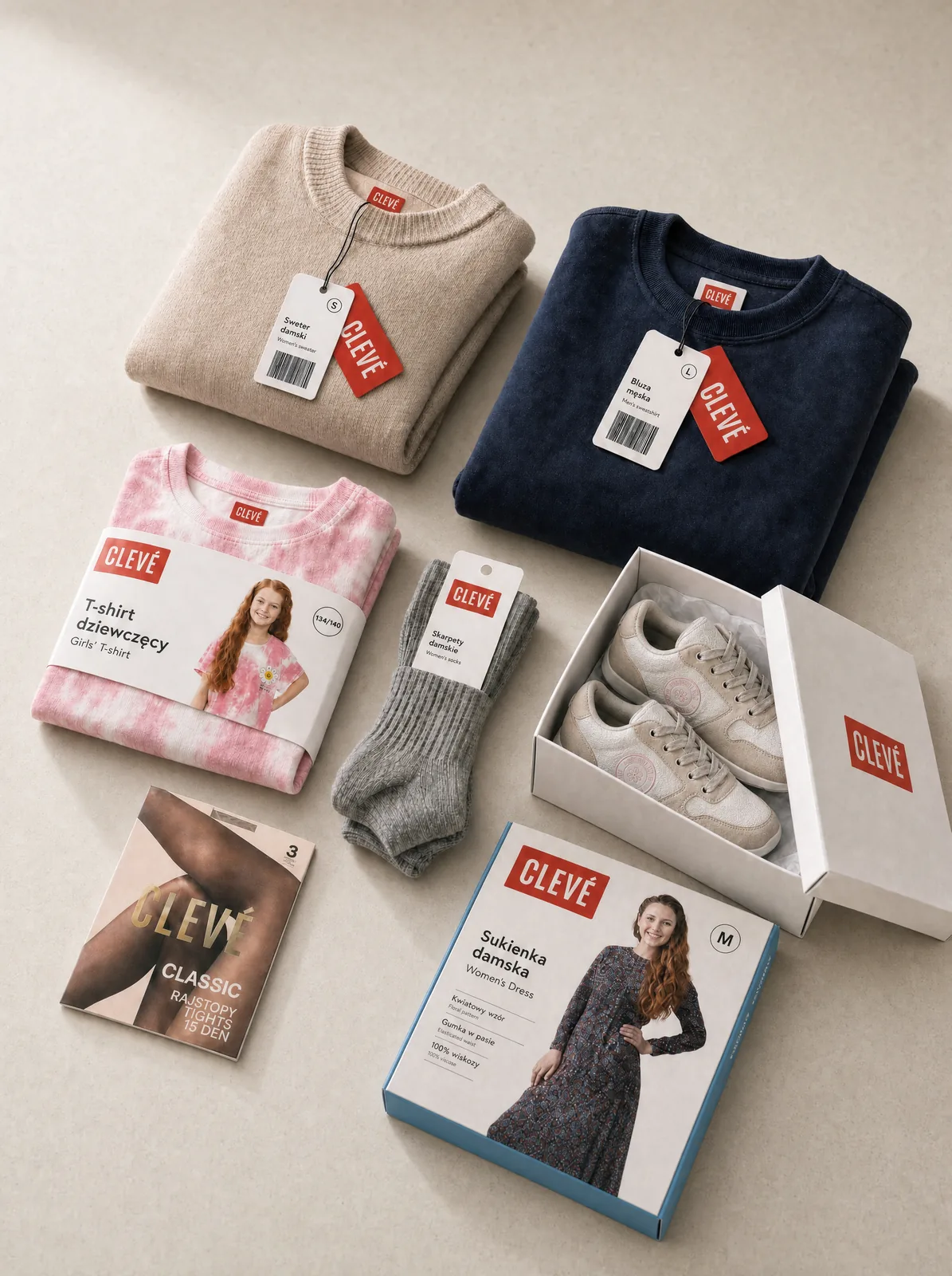
Without a fitting room, the pack does the work — showing the product and building brand presence on shelf. We designed it as one consistent, repeatable system across the assortment.
- Leggings
- Dress
- Sweatshirt
- T-shirt
- Briefs
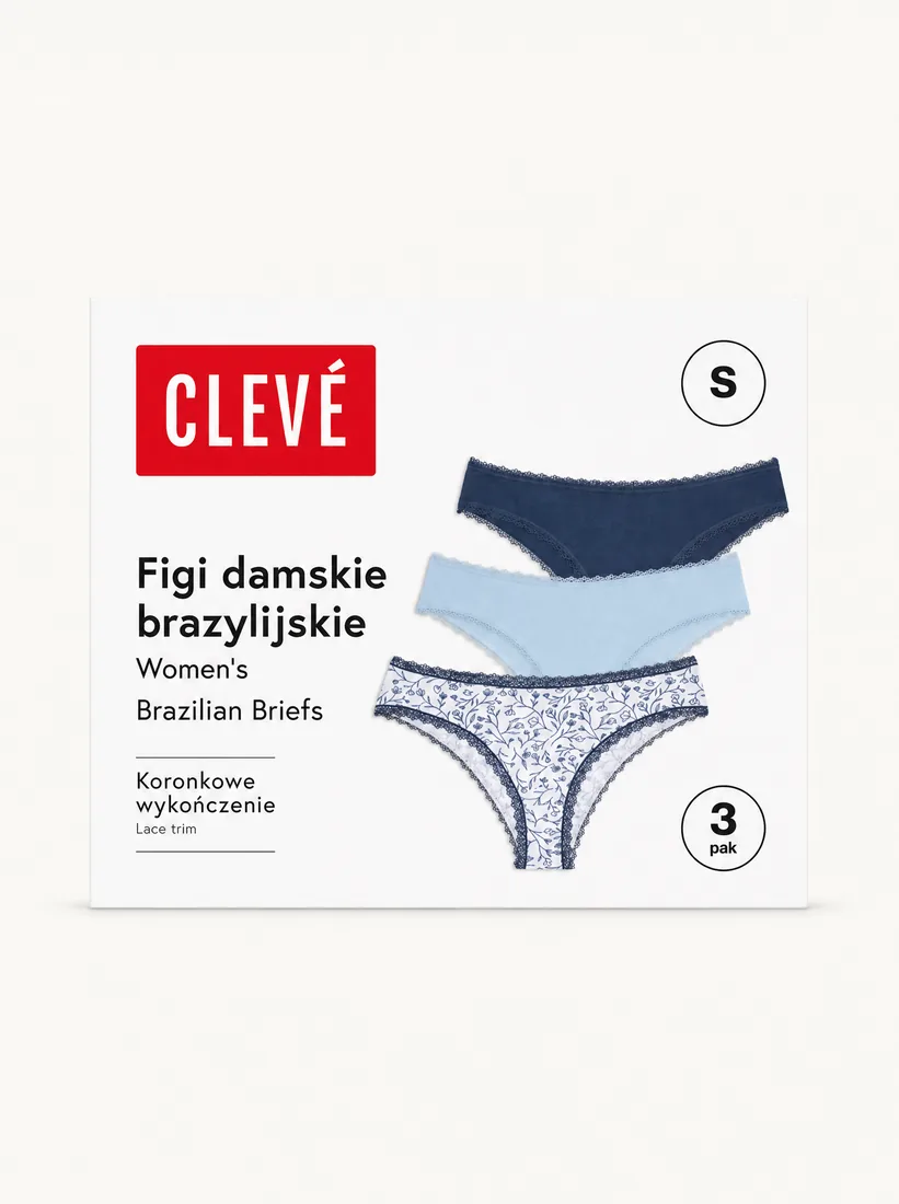
- Shoes
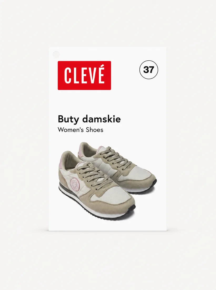
One packaging system across the assortment
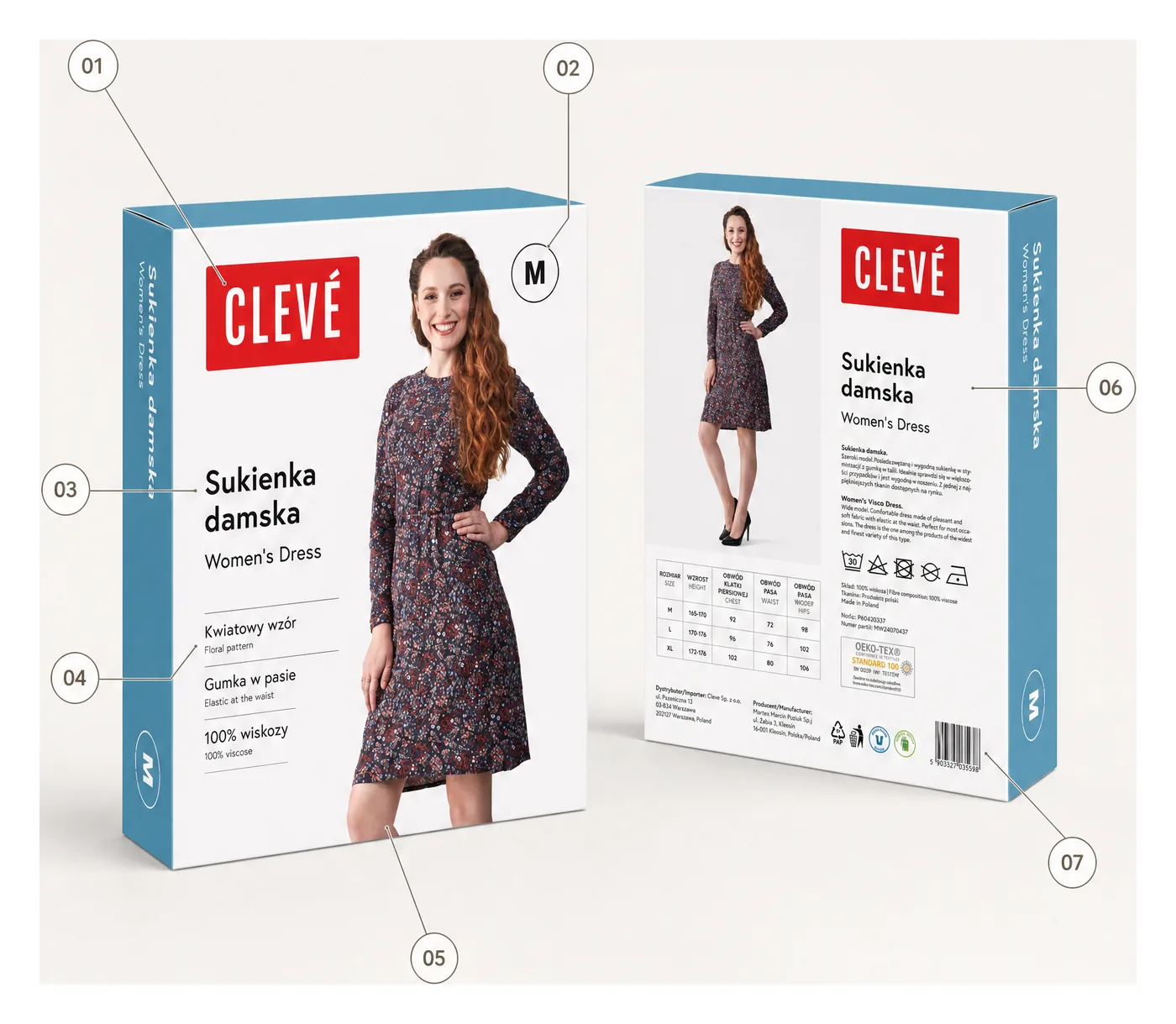
Every pack is a decision-making tool.
We designed the information hierarchy so a customer at the shelf understands, in seconds, what they are holding and why it is worth it.
- Brand block
- Size hierarchy
- Product name & translation
- Material & benefit icons
- Model & product presentation
- Multilingual information
- Barcode / technical area
The product had to be understood at first sight.
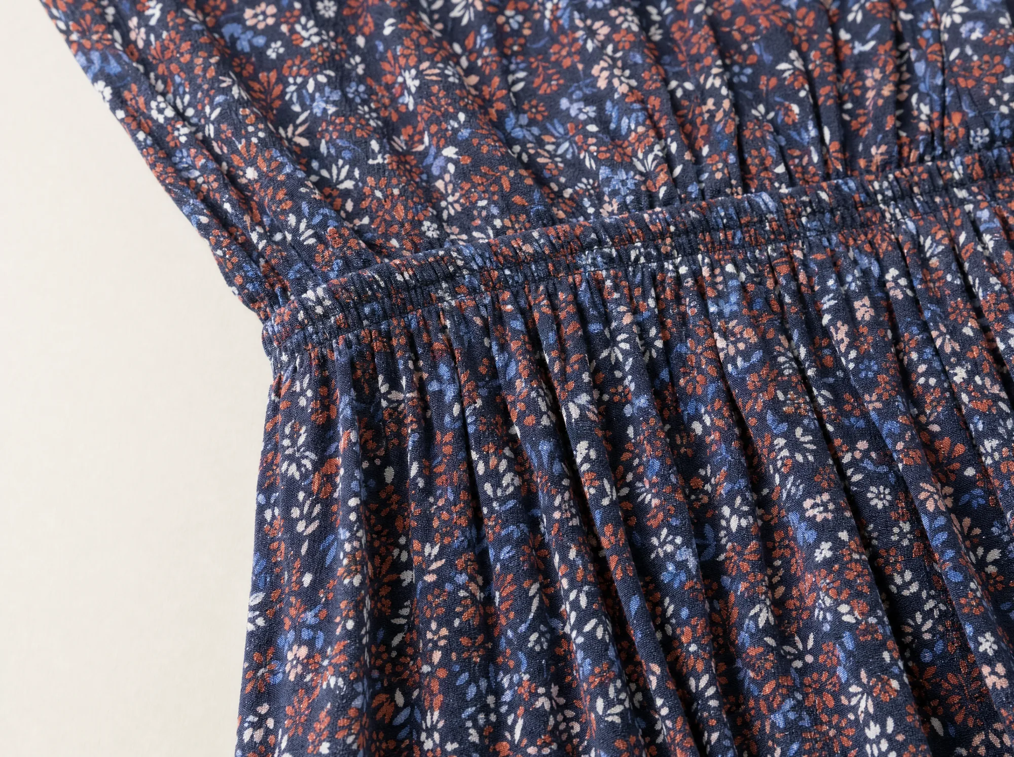
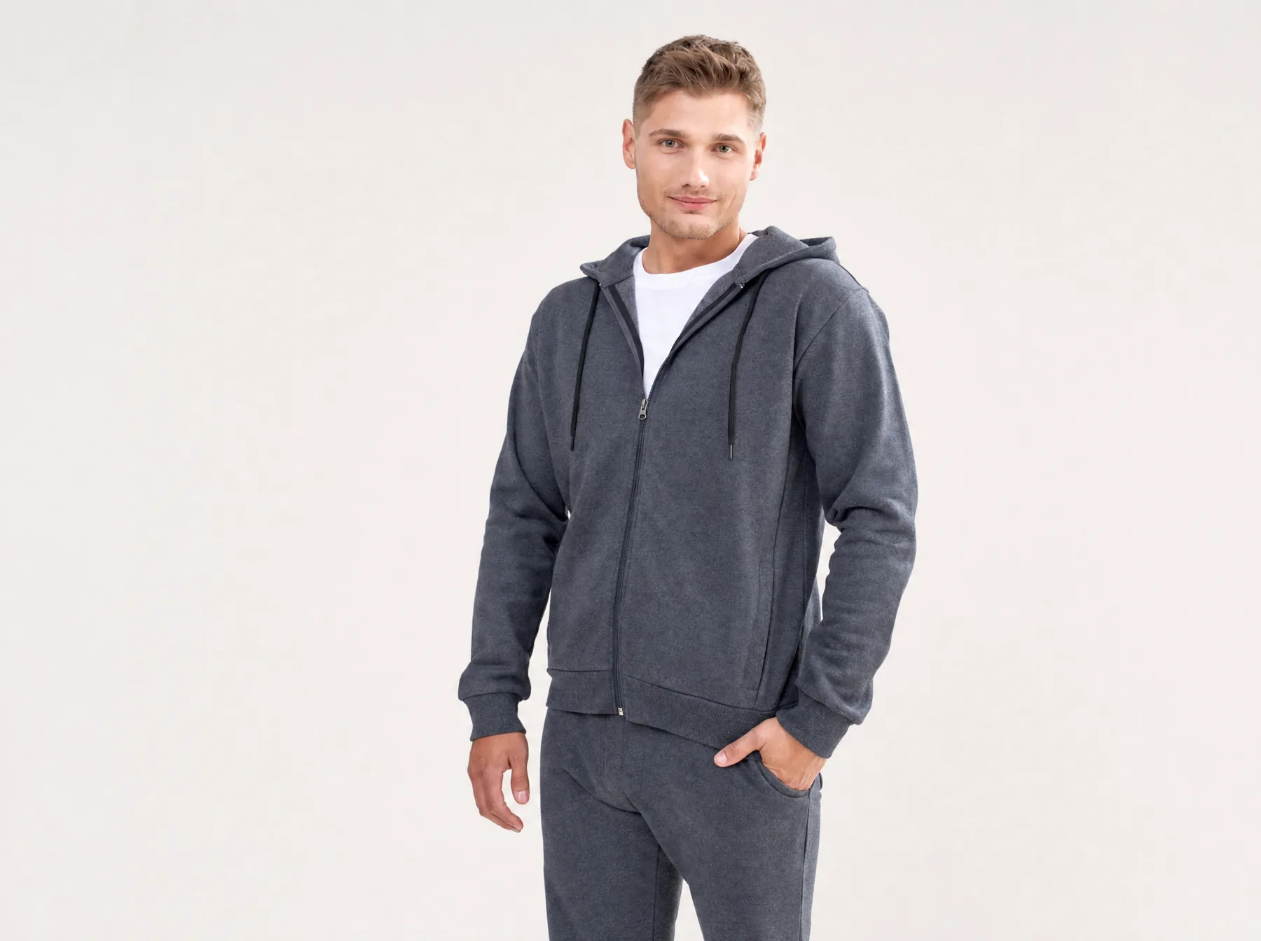
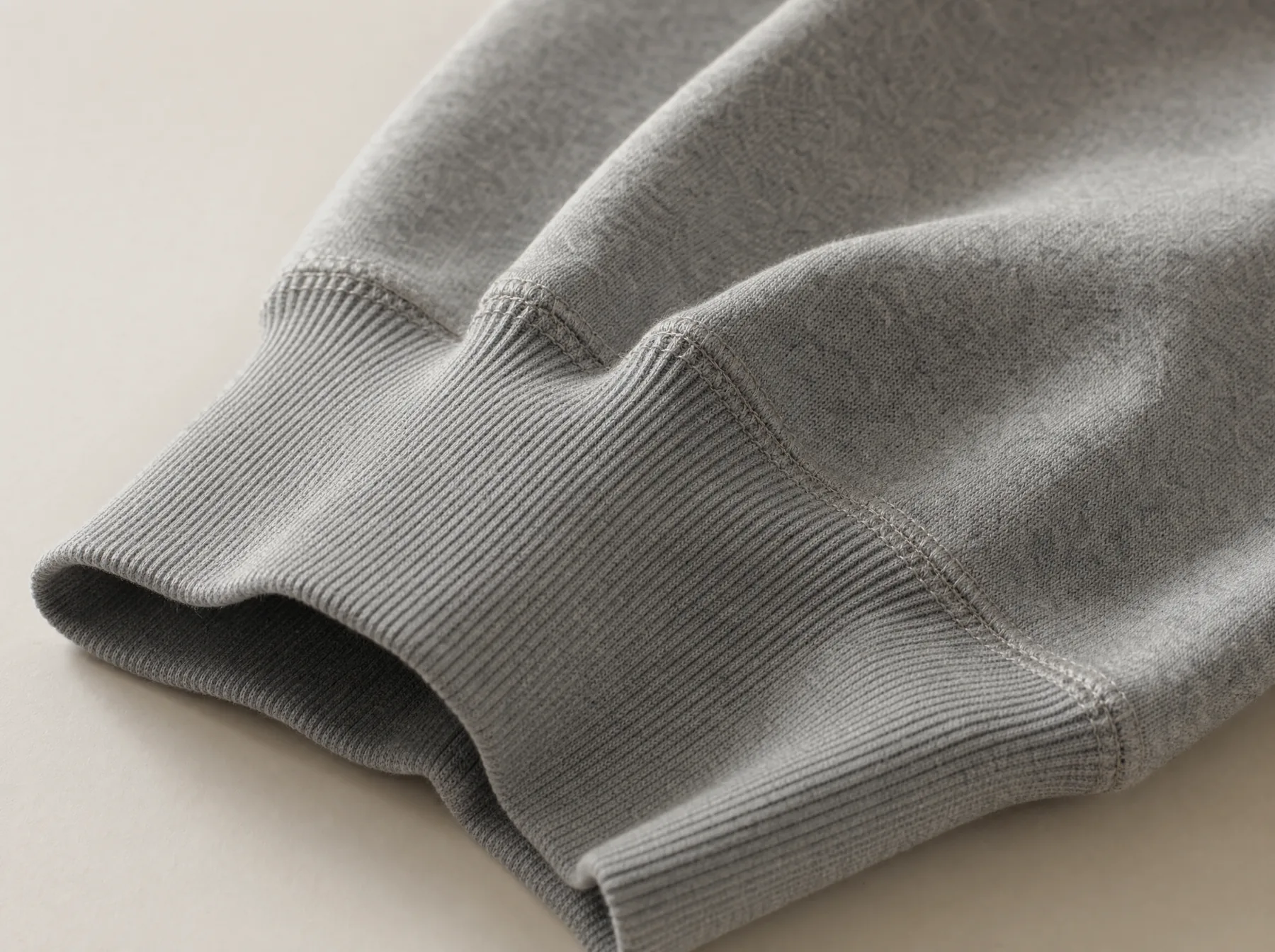
Photography wasn’t decoration — it was part of the information system. The art direction showed the product clearly, consistently and in a way that builds the brand.
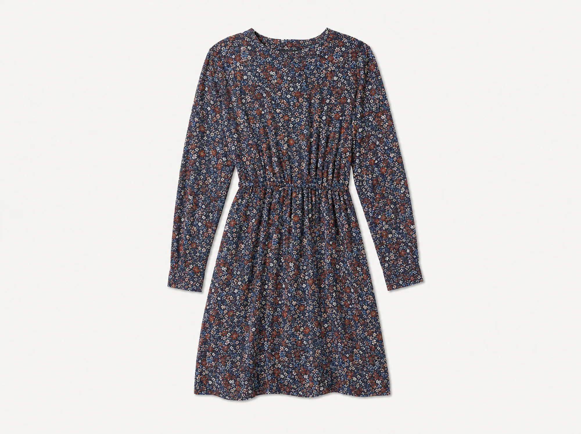
A complete brand system, ready for real retail.
From strategy and naming to identity, packaging, photography and production-ready assets — now in use across Poland and Portugal.
- Complete brand from scratch
- Scalable packaging & identity
- Clearer product architecture
- Consistent across categories
- Retail-ready assets
- Ready across markets
- From scratch
- Strategy → production
- Many categories
- One coherent system
- PL & PT
- Two markets